The best 404 pages have become an art in themselves. They’re part of a website that a brand hopes nobody will ever find, but they need to be there in order to try to avoid losing potential leads when the inevitable broken link arises. As a result some very clever 404 pages almost act like Easter eggs – hidden treats buried in a site – and that feeling of having found something unique can overcome the user’s frustration of not getting to the page they wanted.
The idea is usually to provide enough surprise, amusement or entertainment to stop the user from automatically hitting the back button or exiting the page, which may mean the end of their journey on the site. But the best 404 pages often do this while actually reinforcing a brand identity through a memorable, perhaps even shareable, user experience.
We’ve all seen great examples of 404 pages over the years, and below we pay tribute to some of our favourites. Many clever 404 pages tap into contemporary references, so some of the examples below have since been updated in site redesigns. While humour is a common strategy, others use innovative UX, stunning visual design or even games to help negate the user’s irritation (just remember that the user also needs to be able to find their way on to where they wanted to go in the first place)
To learn more about UX and UI, sign up for our essential online UX design course, UX Design Foundations, which offers a convenient, flexible way to learn all of the fundamentals of UX design. In the meantime, here’s our pick of the best 404 pages we’ve seen.
The best 404 pages
01. Disney
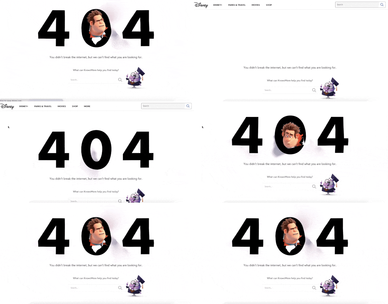
Top of our list of the best 404 pages is this little gem from Disney, which starred not one but two characters from 2018 animated feature film, Ralph Breaks the Internet – a very fitting reference. Our initial reaction on reaching a 404 page will usually be to click ‘back’ but here the intriguing animation might make us stop.
Something’s moving behind the big ‘404’, and chances are the user will hang around for that extra split second to find out what. Ralph appears in the middle of the ‘0’, and we’re informed not to worry, we didn’t actually break the internet. Now we’re hooked, lower down on the 404 page we have the supporting character, the know-it-all netizen KnowsMore offering his search capabilities to take us to where we want to be – an important feature on a 404 page if we want to avoid losing a user.
02. Netflix
You can liven up 404 pages with CSS animation or cool parallax scrolling, but sometimes all you need is a strong visual and some entertaining copy. Netflix has a whole host of content to pick from for its 404 page, and it appropriately went for a still from the movie Lost in Space.
The site asks, “lost your way?” and provides a clear button to take you back to the homepage. The only improvement we could imagine would be to provide a range of films like IMDB does (see it further down the list) to mix it up a bit – which eases the frustration if you hit the 404 page more than once.
03. M&Ms
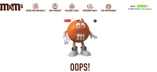
The candy company M&Ms utilises its characters for its 404 page. When stumbling upon the 404 page, you are met by a worried-looking m&m, who is facing down the trouble alongside you. This simple graphic reinforces the m&m branding and raises a smile before you head back to safety.
04. KonMari
A good 404 page should convey a brand’s personality, and Marie Kondo shows how effectively it can do that. Kondo has become hugely popular for her cleaning and organisation tips and products, and the copy on her site’s 404 page humorously espouses that same philosophy of clearing out clutter. It’s a small, concise detail that fans will immediately recognise.
05. Marvel
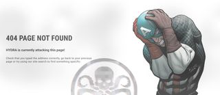
Marvel’s has multiple versions of its 404 pages, which are (of course) all themed around the MCU. We’ve spotted references to Hydra (one of which is above) and the eye of Utau, to name just a couple. Check out the Marvel 404 page to see which one you get.
06. LEGO
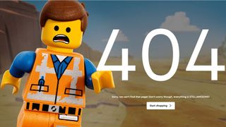
The Lego 404 page is pretty simple but exudes personality. The Lego man’s horrified expression, plus the push on a brand tagline (‘everything is still awesome’) creates an error page experience you’re not sorry you stumbled into.
07. Omlet
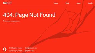
A play on words will get you far, which is why we appreciate Omlet’s approach to its 404 page. The creative company’s page says ‘this page is eggstinct’ as an animated egg crack takes over the screen. The bright red colour shows that this a ‘warning’ while the egg theme fits in with Omlet’s name. What’s not to like?
08. Mantra Labs
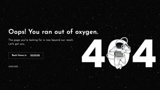
This 404 page from Mantra Labs is simple yet effective. An illustration of a space person floating into the ‘404’ accompanies text saying ‘Oops! You ran out of oxygen’. There’s also a timer counting down to you being directed back to the homepage. If you blinked, you might even miss this 404 page, though it’s worth going wrong on purpose just to visit it.
09. Ready to go survival
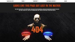
We all love a good movie reference within a 404 page (and there are several of them included in our list). This survival site refers to The Matrix in its 404 page and gives you two options: clicking the red or the blue pill. Naturally, both keep you on the site.
10. Carwow
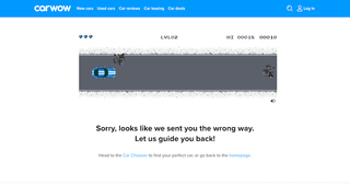
This car buying comparison site helps you find the perfect car, but when you go off course, its 404 page provides a clever on-theme way to keep you on site. Visitors are presented with an 8-bit game style screen. All you need to do is hit the Start text to enjoy the simple horizontal scrolling game, where all you need to do is avoid obstacles and other cars. Give Carwow’s 404 page a try.
11. Ueno
Ueno is a full-service agency with a standout 404 page. What you’re seeing above doesn’t capture the full effort that’s gone into it: the hotdog is animated so it runs in an infinite loop through a surreal landscape, and there are several hilarious explanatory messages to explore. It’s bonkers and totally unique – visit the Ueno error page here.
12. Gymbox
Gym Box is a gym company that aims to offer “the most unique and diverse classes in London”. The limits of that claim might be the kind of magnificent ’80s fitness spectacle that appears on its 404 page. Short shorts, crop tops and pelvic thrusting – what more could you want from an error page?
13. Slack
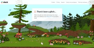
It’s only a slight exaggeration to say that Slack’s 2019 logo update was met with widespread horror, and its super-saccharine 404 page is sure to have its fair share of haters too. Go wrong in Slack, and you’re directed to a magical landscape of lush foliage, mountains and rainbows, where butterflies, chickens and tiny little pigs roam free. The scene scrolls horizontally with your mouse movement, too (try Slack’s 404 page here).
14. Purée Maison
Purée Maison is a creative agency specialising in communication strategy, and its characterful website is full of delightful animations (we’d recommend taking a look around). We’re particular fans of this surreal 404 page, which somehow manages to perfectly capture the pain of hitting a digital wall.
15. Pixar
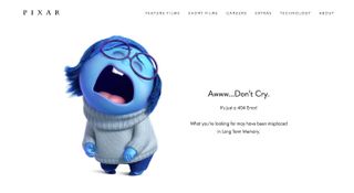
Some people can take things just a little too much to heart. Pixar’s 404 page, featuring Sadness from 2015’s hugely popular Inside Out, is simple, straightforward and does the job. If it’s representative of your reaction to getting a 404 error, though, then maybe you need to re-examine your life a little.
16. 20th Century Studios
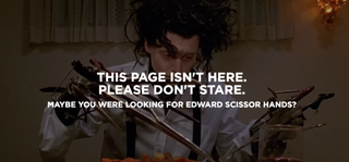
Can’t find the film you want? The rebranded 20th Century Studios (previously 20th Century Fox) has a great way to inspire you for when you get a URL wrong; its 404 page pops up with a still from a cult movie, with a pithy caption and a selection of other films you might like to watch. We’ve spotted snippets from Edward Scissorhands, Revenge of the Nerds and Napoleon Dynamite, amongst others (take a look at the 404 page to see which one you get).
17. Cloud Sigma
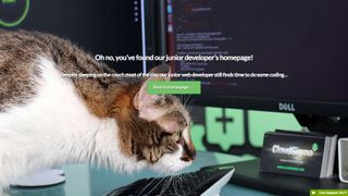
Cloud Sigma is a cloud server and cloud hosting service operating in the US, Europe and Asia-Pacific region. While flexible cloud servers are useful, they’re not exactly fun, which we guess is why the company has made a little extra effort to inject some humour into its tongue-in-cheek 404 error page. We wonder how long it’ll be before this helpful-looking junior developer gets poached by the competition.
18. BluePath
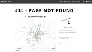
Another website to use humour on its 404 error page is Atlanta-based data strategy consulting firm BluePath. The 404 page shows a map of Atlanta, with a dot on the other side of the page indicating the visitor is ‘Wayyyy off the map’. In an extremely tenuous link, the map also includes data-driven info showing reported crimes in the area. “Why? Because it’s a crime you haven’t hired us for yet!” Ah, these whacky data analysts.
19. Kualo
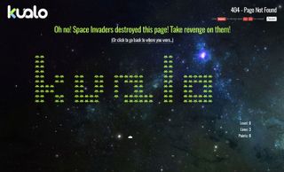
Web hosting company Kualo has been in business for over 15 years – an eternity in internet time – and its 404 page harks back to yesteryear by treating visitors to a game of Kualo-themed Space Invaders. It’s not perfect. The key strategy of picking off the fleet’s outer edges to slow the invaders’ descent doesn’t work, for starters. But it is fun, and it can earn you a discount on your hosting deal if you manage to score over 1,000 points. Play Kualo’s game here.
Its inclusion in this article has also inspired US pest control company Pointe Pest Control to include its own Pest Invaders game on its 404 error page, complete with different flying and crawling bugs to spray.
As Chloe Zollinger from Pointe says: “Reaching a 404 error page is most often frustrating for a site user. We understand how important user experience on a webpage is. To better our visitors’ experience, our team dedicated themselves to creating an interactive game on our 404 page.”
20. Steve Lambert
New York-based artist Steve Lambert describes this as “the most awkward 404 not found page on the internet”, and you know, he may well be right. It features an excruciating piece to camera that just goes on and on. We defy you to get to the end of his video without any part of your body clenching.
21. Lazy Oaf
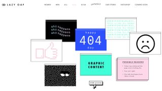
Fashion label Lazy Oaf has taken a fittingly hipster approach to its 404 page. It says ‘happy 404’, ‘shit happens’ and ‘this link is dead’ in fun little boxes, gives you some reasons why you might have gone wrong, including ‘you can’t spell’, and provides a handy link back home.
22. Victoria Spicer
Victoria Spicer is a set designer and prop stylist based in London. As you’d expect, her portfolio site is packed with beautiful photography, and her 404 error page is no different. It shows off her playful side while still keeping things looking polished.
23. Figma
Even though we have a copy of Illustrator CC right here, and could play with anchor points and Bézier curves literally any time we want, we’re still entranced by Figma’s 404 page. Oversized 404 text is rendered in vectors that you can reshape to your heart’s content. Have a go for yourself.
24. Airbnb
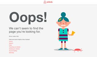
This 404 page from Airbnb features a simple-but-delightful animation of an unlucky girl dropping her ice-cream on the floor. Airbnb has built its reputation on being personable and friendly, and this 404 page suits its brand image perfectly.
25. Hot Dot Production
Hot Dot Productions has applied its ‘where design meets technology’ tagline to its impressive 404 page, which features the three numbers made up of hundreds of tiny dots that change direction or disperse in response to the visitor’s mouse movements. Seriously cool. Play around with it yourself here.
26. GitHub
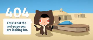
You’d expect some tech wizardry from a website dedicated to code versioning. The 404 page targets a different kind of geeks with a simple Star Wars parody elevated by a smart parallax effect when you move your mouse. GitHub also has a nice 500 page for when the server breaks.
27. Orange Goat
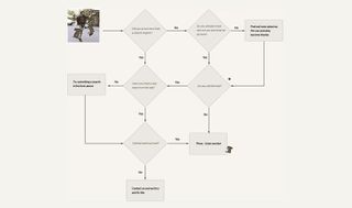
So you’re in the wrong place. Now how do we get out of this pickle? The web design agency Orange Goat takes the time to help the user out with an amusing flowchart that asks them how they arrived at the 404 page and what they’re looking for. It then suggest some suggestions for the next step to take. It makes for a friendly, humourous introduction to the agency.
28. MailChimp
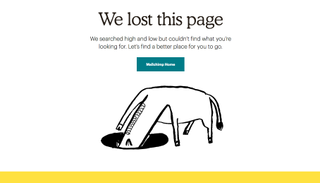
Mailchimp’s error page features naive illustrations around which MailChimp’s branding centres. And really, what says ‘I’m lost’ better than a donkey with its head in a hole?
Volta is a footwear store based in Milan. Its website includes plenty of cool UI design touches, and we like that it’s not just gone for a standard 404 page, either. Good quality, dedicated product photography with a quirky touch – a miniature marble statue that nods to the flagship store’s Italian home – help elevate this error page.
30. Bret Victor
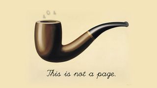
Computer scientist Bret Victor’s 404 page, inspired of course by René Magritte’s iconic painting, The Treachery of Images, confronts the viewer with some challenging philosophical questions. If this is not a page, then what is it? What constitutes a ‘page’? Is it a thing that can be truly said to exist? What is the ‘this’ that this apparent non-page is referring to? Is anything truly real? Makes you think, no?
31. IMDb
Another awesome, movie-based 404 error page can be found on the IMDb website. This comprehensive database of film facts has jazzed up its 404 page with iconic quotes from famous films, subtly edited to fit their new purpose. Take a look at the 404 page to see which one you get.
32. Bit.ly
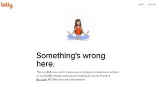
Arriving at a 404 page can be frustrating, so the 404 page for link shortening service Bit.ly suggests taking it with calm. It uses a simple image of someone meditating in an attempt to restore our balance, and provides a helpful reminder that links are case-sensitive.
33. Tripadvisor
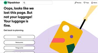
Tripadvisor also attempts to put things into proportion with its 404 page. It’s only a page that’s been lost; not your luggage. The message is accompanied by a flat animation of a rolling case – which admittedly could do with being fixed itself because there were ugly lines around the edge of the image at the time of writing. There are three simple messages that rotate. The others read “Welcome to the 404th wonder of the world,” and “This page is on holiday. You should be too.” The messages are simple but serve to refocus on what the company does, providing options for the services we might be looking for.
34. DropBox
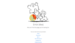
DropBox has replaced the Escher-esque impossible box that adorned its 404 page for years, with a similarly quirky illustration. We like to think of an abstract representation of everything going wrong – the wheels coming off. It’s a nice, simple hand-drawn illustration that gets the message across well, with plenty of helpful navigation links for a top user experience.
35. Blizzard Entertainment
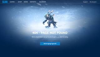
Video game developer Blizzard keeps it simple and on brand with its 404 page. An animated character grabs the attention with a message telling visitors ‘We’ve dispatched a rescue murloc to guide you back to safety’. Not sure what ‘Mmmrrgmgrrrgmmll!’ means but hit the button and back to the home page you go.
Why is it important to have a 404 page?
404 pages are quite unique in that they’re part of your website that you hope nobody will ever find. But they’re essential just in case. With a website of any size, there’s a good chance that at some point links will change or break over time. If a user followers a broken link and end up nowhere, that could be a potential lost lead.
A well-designed 404 page can help prevent that by redirecting the user back to the site, helping them find an alternative path. They can even serve as an opportunity to boost branding while stopping the user from leaving the site.
What makes a good 404 page?
The examples in our list of the best 404 pages show a range of approaches. In many cases, humour is used to keep the user on side amid what can be a frustrating user experience.
Humour or other forms of entertainment can indeed win over an annoyed customer, but it’s important to consider the context of the site you’re designing for because it may not be appropriate in situations where the user may be especially peeved. It’s probably not apt for home banking, for example.
Whichever approach is used, it should feel genuine and reflect the overall brand, rather than be a random joke that has nothing to do with anything the brand does. It’s also important to remember that the main objective is to convince the user to continue on their journey. A cracking joke isn’t much good if there’s no easily identifiable way for the user to get to where they wanted to be in the first place.
It often makes sense to include clear links to key sections of the website on a 404 page, as well as a search field for larger sites.
Related articles:

